As of the workshop held on 1-2 June, 2016, these are the data sets I had to plot for the poster.
EPLAS - Electron Plasma Instrument
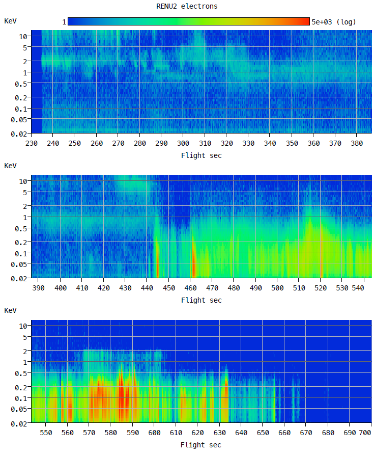
This video was made from the EPLAS image data. Skip to the 2:15 mark of the video to start at T+400. Color scale is units of counts, though a small correction is still missing, so this video an over estimate (David Kenward, 11 May 2016)
Update from David Kenward (8 June 2017):
"electronEnergyFlux.cdf" Contains the electron energy flux (in mW/m^2) and associated time array.
Update from David Kenward (8 June 2017):
"energy_flux_array.sav" can be used to generate an energy flux plot. Units are in mW/m^2
"char_energy_array.sav" contains the characteristic energy in keV
"energy_time_array.sav" contains the electron population due only to precipitation, which is the population that contributed to energy flux deposited in the ionosphere. For most of the flight the loss cone is about 40 degrees.
The data file contains three arrays:
-- E_STEPS is the list of 42 energy bins used in each sweep [eV]
-- FLUX_ARRAY is the data in units of flux [cts*eV/sec/cm^2/sr/eV]. Each column is one energy sweep.
-- FLIGHT_TIME starts at 229.995 seconds and runs through the end of the file at 709.97. Time is spaced 42 ms apart to line up with each sweep in FLUX_ARRAY
**Note** The flux, j, is calculated by dividing the total counts by the 10 degree geometric factor (C_tot/G_10). There should be an extra factor included to account for the number of bins that are accumulating counts (C_tot/G_10/N_bins), up to 30 in total. The total number of bins required for this correction will vary with time, due to the variability in flux distribution throughout the flight. A corrected file will be posted once we determine the best way to do so. (Updated 5/10/16, Bruce Fritz, UNH)
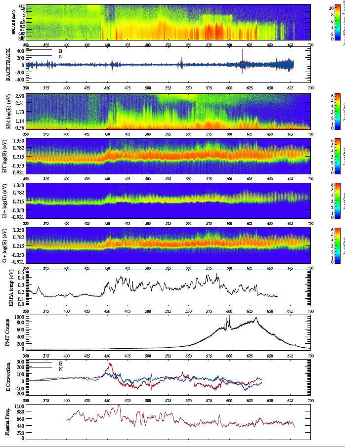
Quick-look summary plot (Svalbard TM) (Mark Widholm, 16 December 2015)
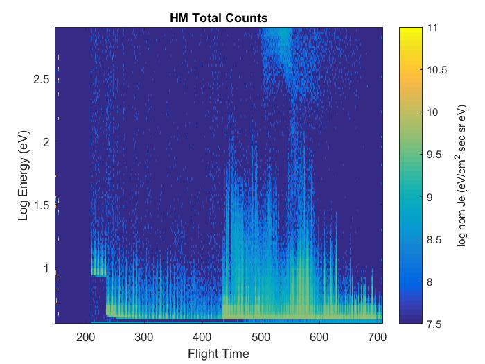
Should have the correct time scale in sec after T-0. Looks like HV on is at about T+233. Good data exists out to approximately 709 sec.
Highest intensity is between T+580 and T+590 and is about 5 MHz event rate with dead-time correction. This pushes the saturation limit but looks ok.
EPLAS housekeeping monitors were nominal for entire flight
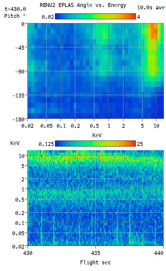
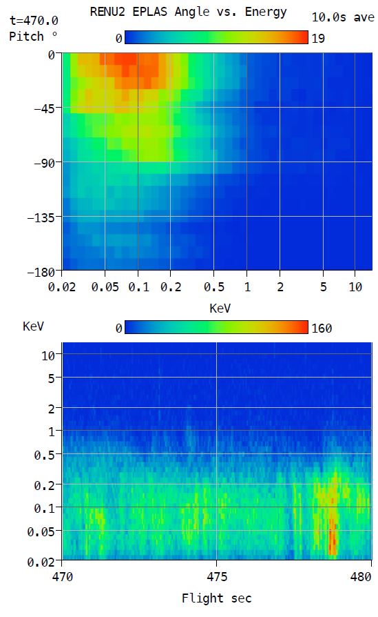
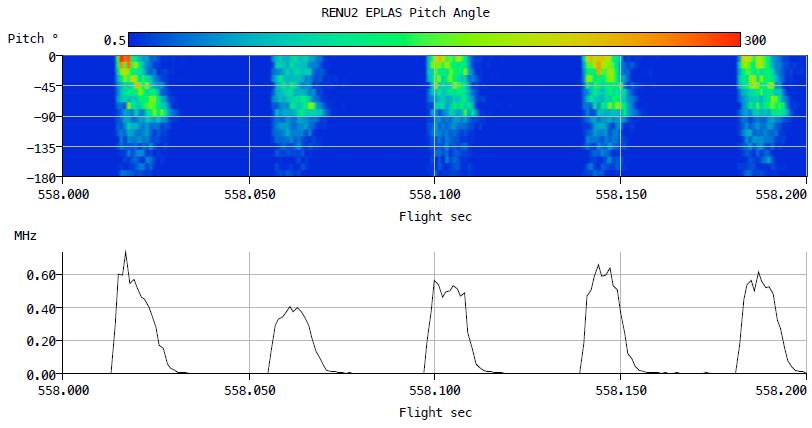
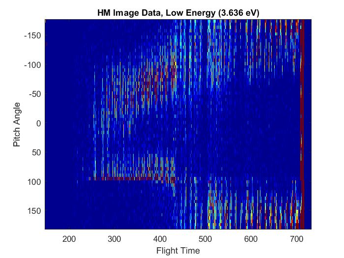
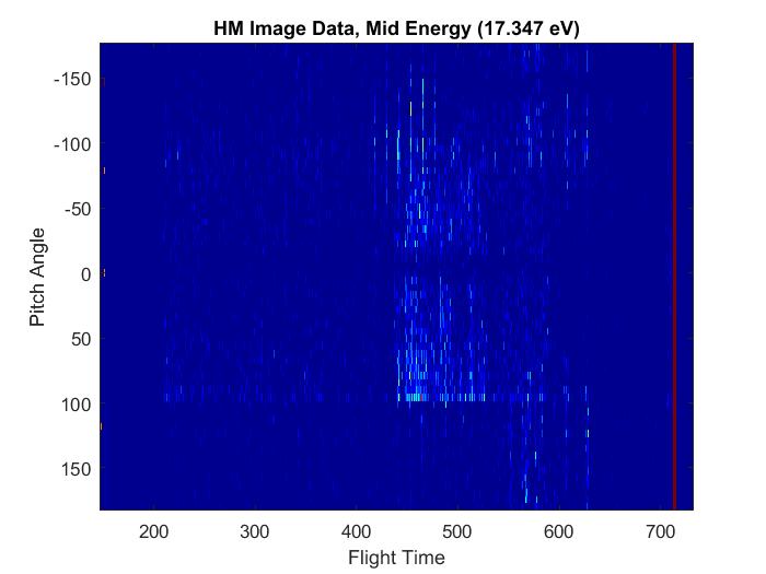
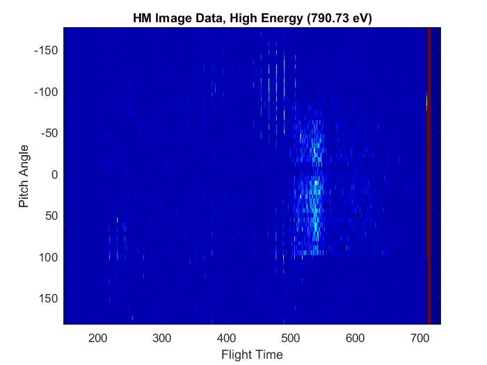
Pitch Angle Distribution Plots (Mark Widholm, 2 March 2016)
These plots assign pitch angle based on the pad look direction and do not correct for the actual payload motion. A crude check of payload alignment based on mag. data shows ~2 deg coning and worst case misalignment of 12 deg. The angle pads are 10 deg wide, so the payload motion would change things a little but the effect would be small. The detector angle pads cover a full 360 deg. The pitch angle bins are the average of two pads when available. There are blind spots so some pitch angles only have data from one pad.
The most intense bursts from 560 to 600 sec have very high count rates (over 5MHz). The angle imaging does not work well above 2MHz and this plot does not give an accurate representation in these regions. However, there is no reason to think that the distribution is anything other than tightly field aligned.
Above are a few sample plots that preserve pitch vs. energy distribution.
"pa430.pdf" (top left) shows the distribution of the high energy electrons at 430 sec. The energy peaks near 10KeV and 1KeV are mostly spread over the upper hemisphere.
"pa470.pdf" (top middle) shows a region with fairly constant low energy precipitation. The pitch angle distribution shows that it is mostly field aligned but is spread out some especially at higher energy.
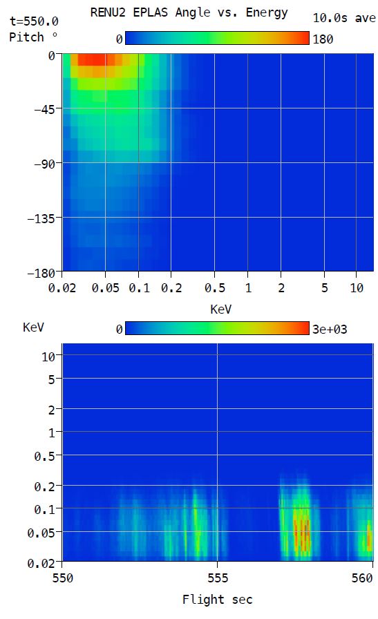
"pa550.pdf" (top right) shows an interval containing intense low energy bursts. Almost all the flux is below 100eV and within 10 deg of the field. Note that there are multiple bursts of very short duration.
"pa558.pdf" (below) shows a close up of a few individual energy sweeps. In this plot you can see the flux at low energy is field aligned but it tends to move towards 90 deg with increasing energy.
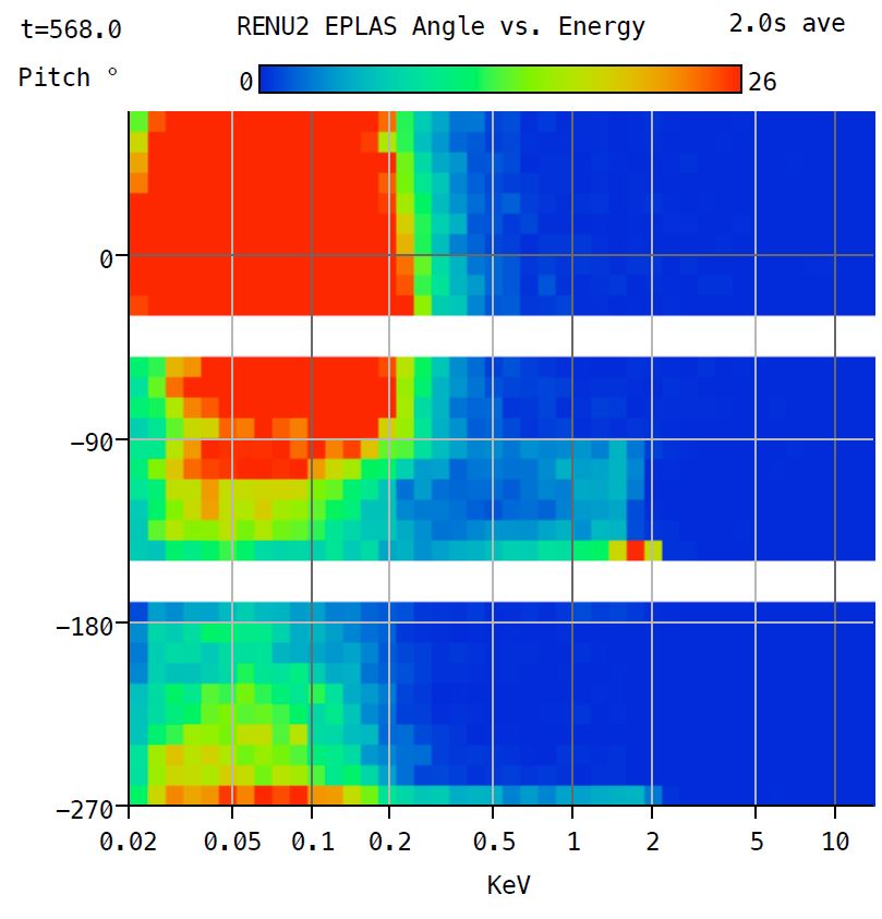
2 keV "mystery"
The plot to the left is strong evidence that the weak 2KeV population seen in the energy spectra from 556 to 605 sec is artificially produced in the detector itself.
The main population during this time is all below 500eV. There is a sharp source of 2KeV electrons seen at -145 deg just above the edge of the blind spot. This happens to be the location where the wire bundle for the other detector passes through the entrance aperture.
It's not clear how the wire bundle is able to create an artificial 2KeV electron source but this appears to be the most likely explanation. The bundle contains a HV wire with approximately -2KV MCP bias but it is shielded.
HEEPS-M & HEEPS-T - Ion instruments
HM TC and HT TC plots
Meghan Harrington, 26 April 2016
This is our e phi float model where e phi float = 5 Te + 1/2 m v_r ^2 where v_r is the velocity of the ram. We assume that this gives us the minimum energy that ions will come into our detector at.
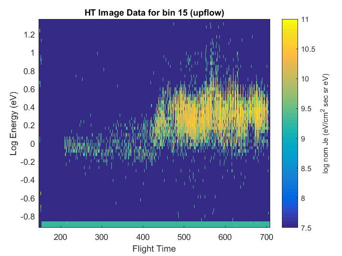
HTI and HMI uplooking bin plots
Meghan Harrington, 26 April 2016
These are plots from the HT detector and HM detector where we are just looking at an upflowing pitch angle.
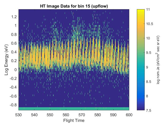
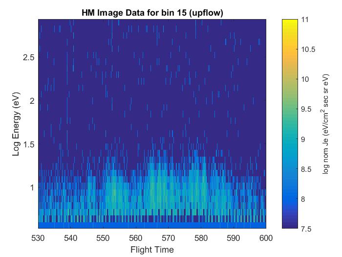
Upflow event plots
Meghan Harrington, 26 April 2016)
These are plots from our HT detector and HM detector where we are just looking at an upflowing pitch angle.
Energy channel pitch angle plots
Meghan Harrington, 9 March 2016
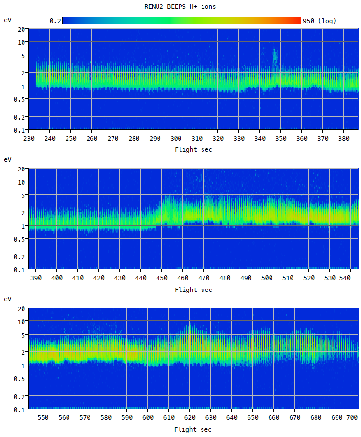
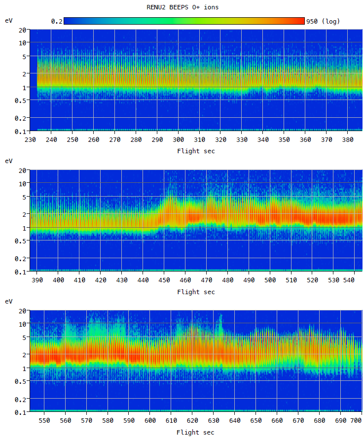
BEEPS - Ion Magnetic Mass Spectrometer
Quick-look summary plot (Svalbard TM) (Mark Widholm, 21 January 2016)
H+ summary plot
Data starts at 230 sec, just before HV turn on at 230 sec and continues at 1 ms intervals through LOS.
O+ summary plot
Data starts at 230 sec, just before HV turn on at 230 sec and continues at 1 ms intervals through LOS.
Update:
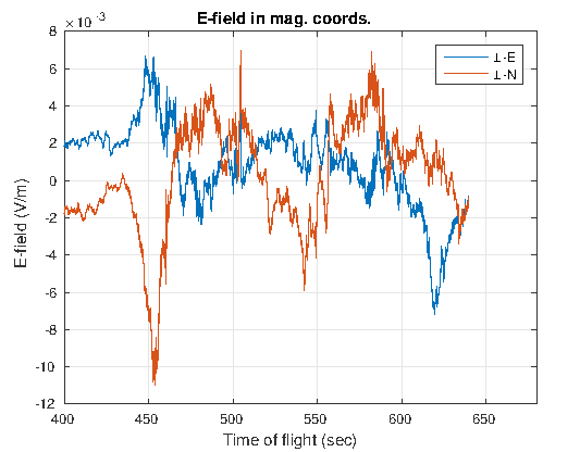
Further analysis of the COWBOY data has been provided by Meghan Harrington (Dartmouth, 8 June, 2017)). "E-fieldcalcs.mat" contains the despun electric fields with the v x B component removed. Units are volts and components are labelled EpN and EpE for perpendicular North and perpendicular East geomagnetic coordinates.
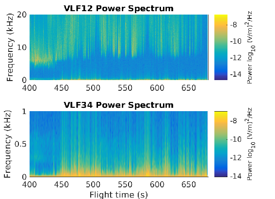
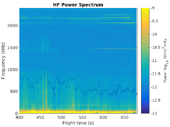
Additional data files are included now as well to provide HF and VLF data.
Original files provided by Dave Hysell (25 Mar 2016).
"convection.mat" contains the DC convection electric fields. Coordinates are in geographic coordinates (east and north)
"plasma_freq.mat" contains the plasma frequency inferred from the VLF spectra
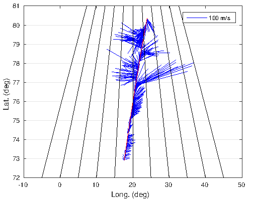
E-field plots (Dave Hysell, 17 March 2016)
The top plot is HF data in spectrogram format from one of the baselines. The middle plot is a zoomed in plot of the top plot with an upper limit of 1 kHz on the frequency axis.
The next plot is the DC electric fields with the v x B component subtracted (fields as seen by a stationary observer).
The bottom plot is a feather plot along the trajectory of the rocket flight.
Original .eps files are available by clicking the images
The data file contains two arrays:
DATA_ARRAY is the raw, uncalibrated data counts.
FLIGHT_TIME starts at 230.0 seconds and runs through the end of the file at 1 ms intervals.
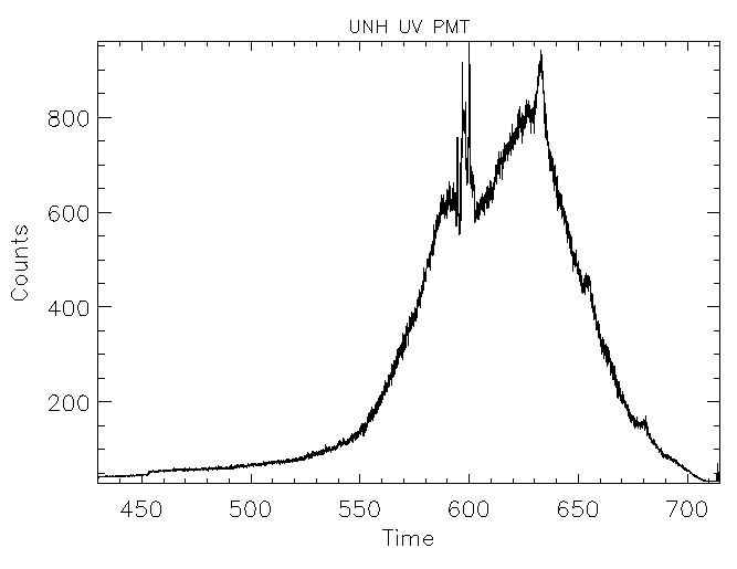
Data Plot (Svalbard TM) (Bruce Fritz, 21 January 2016)
UV PMT data is a plot of counts vs time. Time resolution is 1 ms. The black trace is a smoothed plot of the raw data using a 100-pt boxcar smooth function in IDL.
The UV PMT measures neutral atomic oxygen density variations ABOVE the payload by measuring sunlight scattered from the atoms. It was included on the payload following a suggestion from Dirk Lummerzheim, but is not a calibrated instrument.
An identical UV PMT has been built and will be calibrated in order to estimate the brightness in Rayleighs. The data appear to be excellent and seem to show enhanced oxygen densities in the region of electron precipitation, as hoped for. Before T+455 or so, there is no significant precipitation and we believe that the signal strength dropped below the noise floor of the PMT.
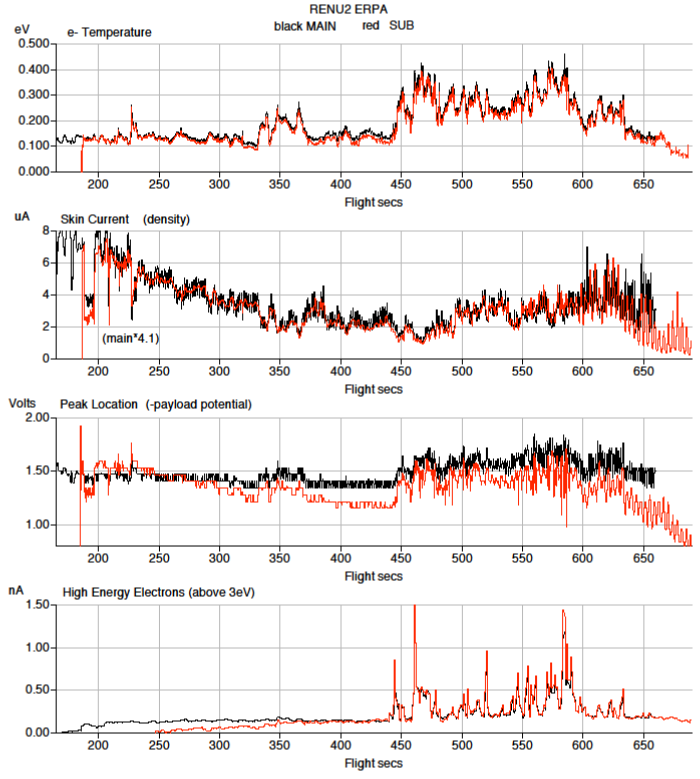
Data in each file is identical. For the Main ERPA file:
MHI_TIME - 90.0 to 659.85 sec, 128 ms intervals
MHI_ARRAY - Sum of steps above 3eV (High energy electrons)
MPEAK_TIME - 165.0 to 659.85 sec, 256 ms intervals
MPEAK_ARRAY - Voltage at peak. (-payload potential)
MSKIN_TIME - 90.0 to 660.0, 500 us intervals
MSKIN_ARRAY - Skin Current in uA (density)
MTEMP_TIME - 165.0 to 659.85 sec, 256 ms intervals
MTEMP_ARRAY - Electron temperature fit results in eV
For the sub files, just replace the leading "M" with "S"
TIme tags are within one sample period. This data was extracted quickly from the Andoya TM file just to create the summary plot. More precise start times exist but would need to be extracted with more care. Missing data is flagged with NaN codes.
Temperature Plots (Andoya TM) (Mark Widholm, 22 December 2015)
Main payload current is about a factor of 4 lower than the sub. Plot is main current * 4.1 to illustrate agreement in behavior. Presumably the scale factor difference is due to sheath effects from other stuff mounted near the main payload ERPA.
Notch in density before 200 correlates with ACS roll control to 1 Hz
Payload potentials are not expected to be the same. Main/sub could have much different ion-electron current balance
Both payloads see spin modulation in the potential (possibly from sunlight?)
Both see very similar high energy electrons that match up nicely with locations of electrons seen by EPLAS
Sub payload data ends about 30 sec after the main payload. Might be more data available from another antenna.
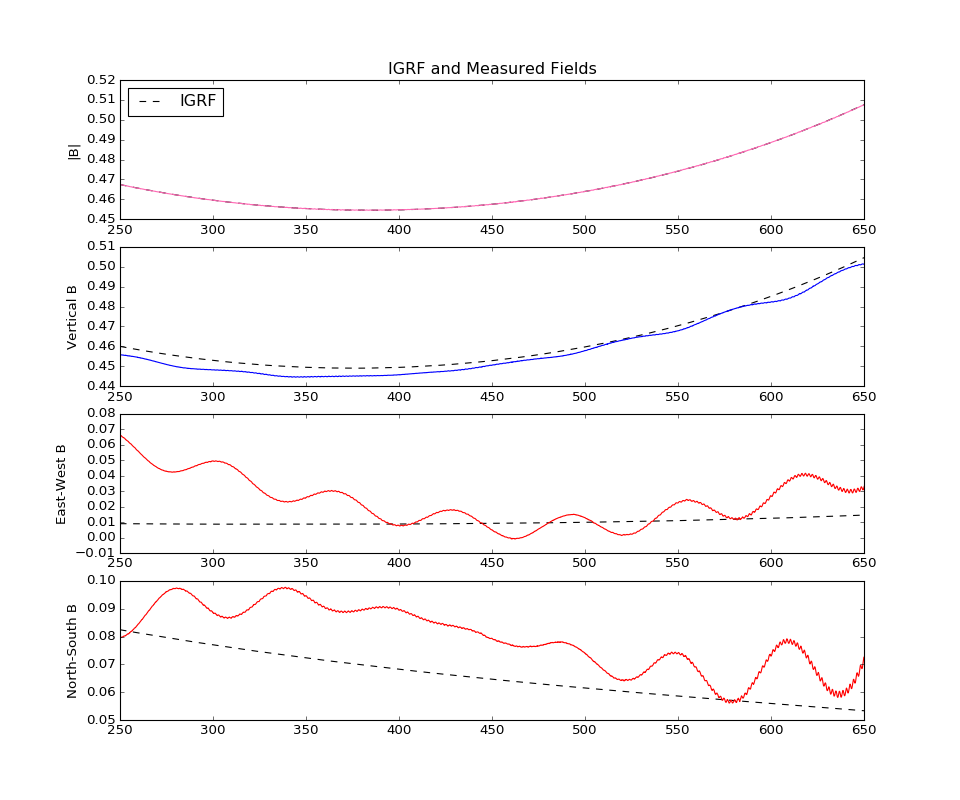
calibrated, spinning mag data (Bx, By, Bz) [Gauss]
calibrated, despun mag data (B_down, B_east, B_north) [Gauss]
IGRF (B_down, B_east, B_north) [Gauss]
payload position (alt, lat, lon)
Python Pickle (.p) file contains the same information as the Matlab file, with "Attitude Solution" below
"Despun East" etc are binary files with just the self described data set contained. Data is space 1 ms apart. Data type is double and big endian. Data starts at t+230 s.
Updated Data (Max Roberts, 23 Jan. 2017)
Max has provided the most recent despun solution of the Billingsley magnetometer data.
A couple of warnings...
There is still a pretty strong coning signature on the despun measurements.
The IGRF field and positions are set to the same sampling as the mag sample rate BUT there are lots of redundant values (limited resolution). Some interpolation would be better, I just wanted to make it easy for you to plot things against each other quickly.
The mapping I used to go from despun mag coordinates down/east/north was Bx -->B_down, By -->B_east and -Bz --> B_north. Haven't double checked that this is right so there's a chance of sign error. Double check this.
The calibration process is performed inflight. Using the known magnitude of the magnetic field at the payload location (from IGRF), the best fit values are found for the gains, offsets and axis-coupling coefficients (nonorthogonalities). The idea is to find these 9 constants so as to minimize the difference between |BIGRF|-|Bmeasured| over the flight. This is what the data should look like:
EISCAT
A summary for each day of the campaign in which EISCAT was operating is located here.
Data File (Kjellmar Oksavik, 22 Feb 2016): EISCAT DATA
This data file is formatted as: Header Line X lines of data Blank line new header line, etc....
Each header contains (from left to right):
DD-MMM-YYYY
HH:MM:SS-HH:MM:SS
Antenna Azimuth [deg]
Antenna Elevation [deg]
Radar Site GLAT [deg]
Radar Site GLON [deg]
Radar Site Altitude [km]
Number Lines Of Data
Each individual row of data contains (L to R):
Height [km]
Log10(Ne)
Te [K]
Ti [K]
Vi [m/s]
Ne % Error
Te % Error
Ti % Error
Vi % Error
e.g. if the value for Ne is 10.5, it means that the electron density is 10^10.5 in units of m-3. For Vi, positive values mean upflow.
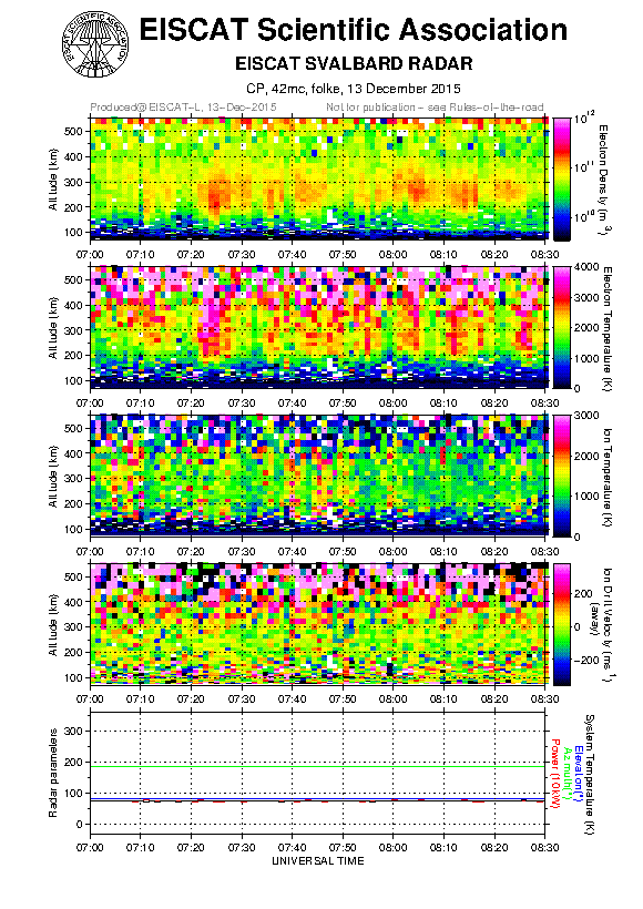
42m EISCAT Plot (Kjellmar Oksavik, 22 Feb 2016)
Kjellmar has reanalyzed the EISCAT data with different resolution, and found that 120 seconds integration gave the best temporal resolution vs. signal-to-noise.
In the figure you see:
There were several transient enhancements in the electron density, and around launch we only saw the F-region (consistent with the cusp)
Throughout the interval there were several transients in electron temperature, which would be consistent with PMAF activity
The Joule heating was mostly seen in the hour prior to launch, but there may be some weak Joule heating around 07:38 - 07:48 UT
There appears to be weak ion upflow in the topside region (above 400 km altitude) throughout the interval. Around 07:34 - 07:48 UT the ion upflow appears to have been extending all the way down to 300 km altitude
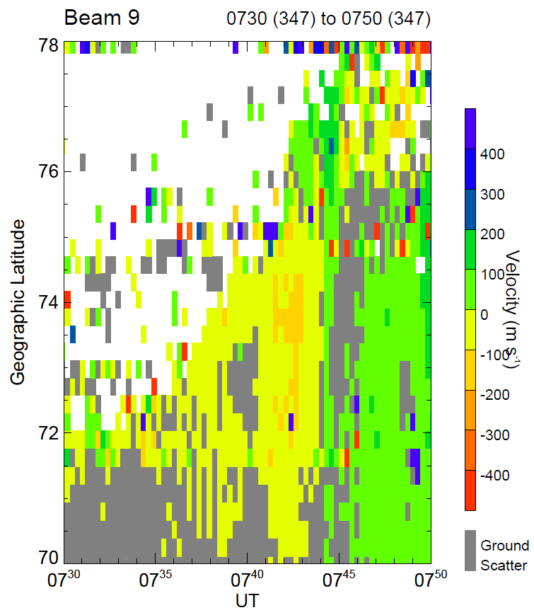
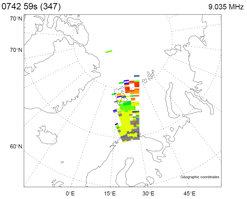
CUTLASS SUPERDARN
Hankasalmi Summary Plots (Tim Yeoman, 5 February 2016)
Initial plots of CUTLASS SUPERDARN data have been provided. Click the images to access the full PDF of plots, a couple examples are shown to the left. The PDF contains:
1) Time series plot of Beam 9 from 0700 to 0800. Beam 9 looks directly at Svalbard.
2) Time series of Beam 9 zoomed in to show 0730 to 0750. (top left)
3) Zoomed in time series plots of Beam 9 shown for each for each of three frequency ranges -- 9.9 to 10 MHz -- 8.9 to 9.1 MHz -- 8.3 to 8.4 MHz
4) Map view of the Hankasalmi data taken at 0742 59s (freq. 9.925 MHz)
5) Map view of the Hankasalmi data taken at 0742 59s (freq. 9.035 MHz) (bottom left)
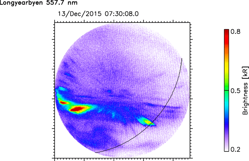
U. Oslo All Sky Imager
Footpoint measurements (Lasse Clausen, 31 March 2016)
The data in the links to the left are IDL save files containing, again for the 630.0 nm channel and the 557.7 nm channel, the brightness at the payload footprint (variable named foot_bright with seconds after launch in foot_secs or Julian day in foot_juls - use IDL's JULDAY and CALDAT to convert to day, month, year, etc) and the brightness at the payload location at T+600 in t600_bright together with the Julian day in t600_juls.
Example syntax:
restore, 'renu2_asi_bright_i6300.dat'
plot, foot_secs, foot_bright
To access the raw images used to create these plots, they are accessible HERE.
The "overview" PDFs contain the rocket trajectory, keograms from the Longyearbyen imager (along the magnetic meridian), and 1-minute interval snapshots of the auroral activity and the rocket position, both for the red and green line. The red line is mapped to 250 km altitude, the green line to 150 km.
The "foot" files show the auroral brightness along the track and also at the location of the rocket at T+347s and T+600s. The rocket position is mapped along the IGRF to the red/green altitude (250 km and 150 km, respectively). The brightness of a 20 km radius around the mapped rocket location is calculated. That is shown on the first page as an
example: the right shows the auroral image, the left the distance of each mapped pixel to the mapped rocket location - the points which are not red are averaged as the footpoint brightness for that particular mapped rocket location.
The footpoint brightness is then shown on page two - the sharp jumps are a result of the imager time resolution - 30 seconds for 6300 nm and 20 seconds for 5577 nm, i.e., every time the brightness jumps, a new auroral image was available.
The last two plots show the time history of the auroral brightness at the (mapped) location the rocket reached at T+347 and T+600 s.
These are keograms along the rocket trajectory ("footkeo", mapped to 150 and 250 km along the IGRF). UT is on the horizontal axis and time after launch on the vertical axis. The rocket "trajectory" in these plots is the black line.
To get a sense of the auroral history at the location the rocket reached, say, 400 seconds after launch, look at the brightness values along a horizontal line located at a y position of 400. The last two plots in "foot" are then horizontal slices through the keogram in "footkeo".
ANGARR - just the angles used in the MSP plot from 0-180 degrees
TIMEARR - the time in hours for each time slice
BPLOT, GPLOT, RPLOT - 2D arrays for the 4278, 5577, and 6300 lines, respectively. The data here is in raw counts. To plot the data in a manner similar to the images below, the data must be converted to a log scale in some manner such as bplot = alog10(abs(bplot)+1)
The top plot to the left show MSP keograms for the 4278, 5577 and 6300 nm channels. The top plot shows the time history of the morning of launch from 0600-0900 UT. Intensity is on a Rayleigh (log scale).
The 2nd plot down shows the same keograms zoomed in for the time period 0720-0800 UT on 2015.12.13. The dotten lines show projections for distances to observed features. Lines represent 100 km, 200 km, 300 km, and 500 km.
The third plot breaks out individual angular bin for the 630.0 nm channel over the time span 0600-0900. Angular bins plotted are 30, 50, 70, 90, 110, 130, and 150 degrees.
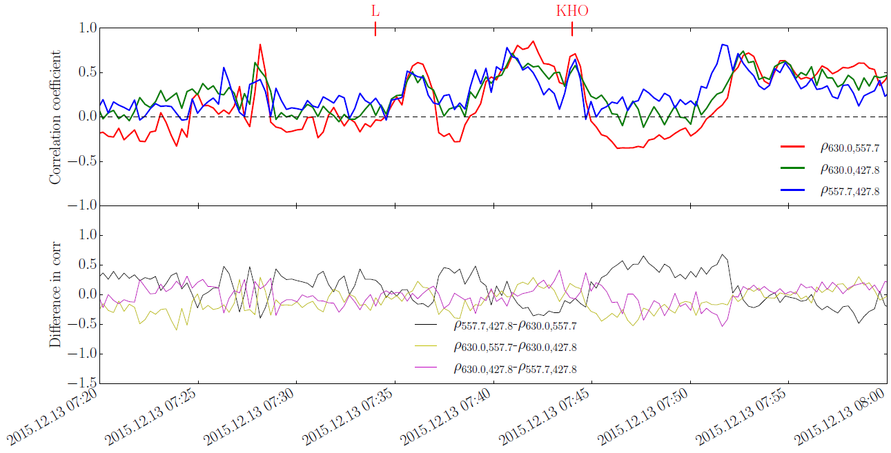
The bottom plot shows the correlation coefficient between each of the three panels, which shows fairly good correspondence between each of the three channels for most of the features observed.
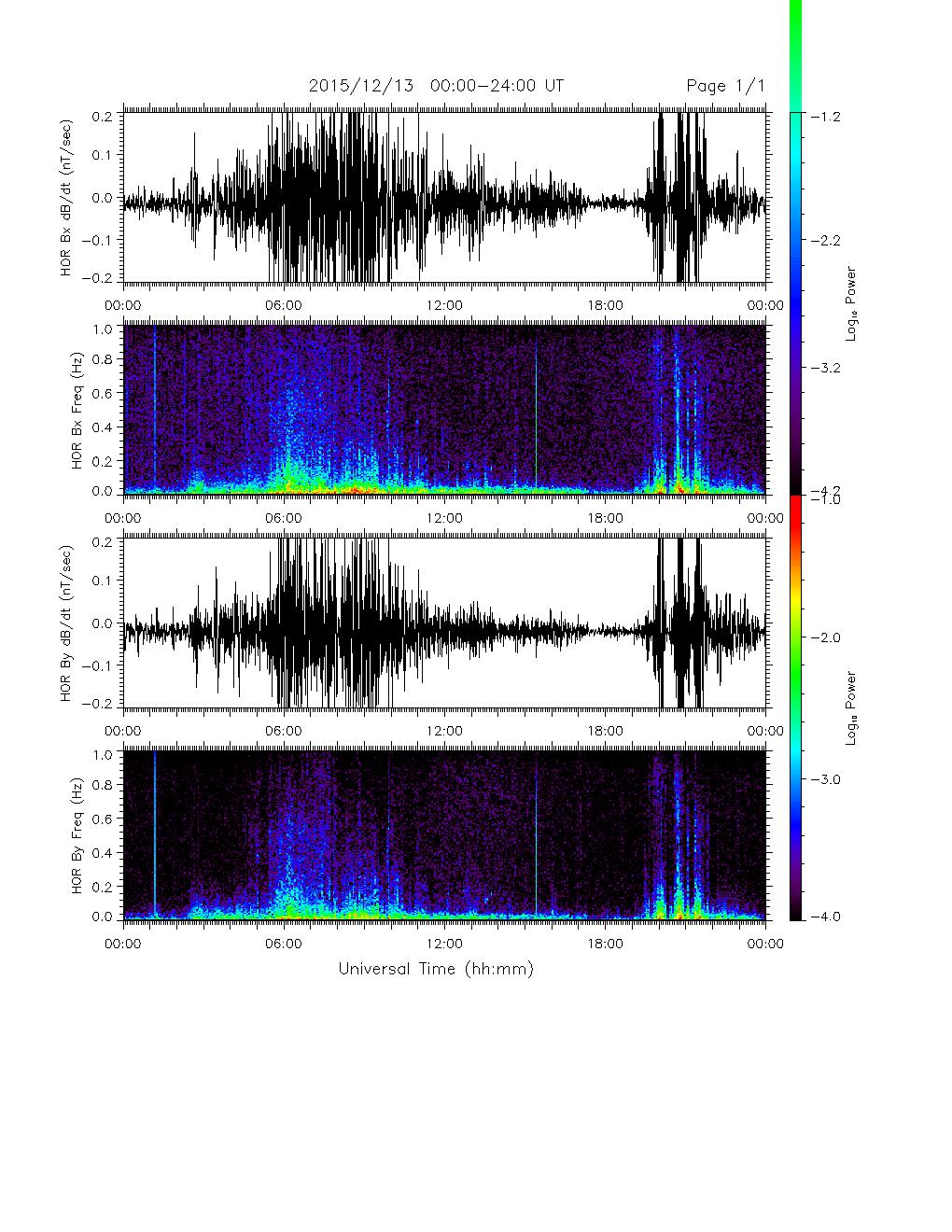
The data in the text file is used to generate the plot below. The columns are left to right: time (sec), dBx/dt (nT Hz), and dBy/dt (nT Hz). Bx and By are the components perpendicular to the local field line.
Summary plot from the ULF Searchcoil System at Hornsund on the island of Svalbard.
The data in the text file covers days 342-365 of the year 2015, which includes the date of the RENU 2 launch (Day 347).
From Cheryl Huang (AFRL): he format description is in the header. It gives the day and time (in UT seconds), satellite location (geodetic latitude, longitude, height), local time, GRACE density at that location, MSIS at GRACE location. You need to adjust the GRACE density to a fixed altitude and look up the MSIS value at that fixed altitude. Then you scale all the densities to that altitude by the ratio of (MSIS_at desired altitude)/MSIS_at GRACE altitude).
In my paper, and most papers that use Eric's data, I use averages of the data over 3 deg latitude bins. You can choose to use the original 5-sec data if you wish. Please acknowledge Eric in papers if you use his data.